DelphiにはTLabeledEditというコンポーネントがあり、
TLabeledEdit は、ラベルが関連付けられている編集コントロールです。
という説明のとおり、テキストボックスに説明用ラベルがセットになっている。 これをXAMLで書けないかと試してみた。
環境
- Visual Studio 2019
- WPFのプロジェクトでサンプルを作成
カスタムコントロール(LabeledTextBox)作成
Visual Studioで新規のカスタムコントロールを用意する。新規作成後はこんな感じになってる。
public class LabeledTextBox : Control
{
    static LabeledTextBox()
    {
        DefaultStyleKeyProperty.OverrideMetadata(typeof(LabeledTextBox), new FrameworkPropertyMetadata(typeof(LabeledTextBox)));
    }
}
コントロールの名前はLabeledTextBoxにした。TextBoxクラスをカスタマイズしたいので、継承元をControlからTextBoxに変更する。
public class LabeledTextBox : TextBox
テキストボックスとラベルが一体化したコントロールにしていくため、このクラスにプロパティ、そのプロパティを利用できるようにXAMLを編集する。
Titleプロパティ
Titleプロパティは、テキストボックスの横に「氏名」とか「電話番号」とか、テキストボックスの横に置く説明用のプロパティなので、string型、初期値は空文字にする。
1から自分でコードを書くより、スニペットのpropdpで書くと楽。
/// <summary>
/// Titleプロパティ。
/// </summary>
public string Title
{
    get { return (string)GetValue(TitleProperty); }
    set { SetValue(TitleProperty, value); }
}

public static readonly DependencyProperty TitleProperty =
    DependencyProperty.Register(nameof(Title), typeof(string), typeof(LabeledTextBox), new PropertyMetadata(""));
TitleWidthプロパティ
TitleWidthプロパティは、Titleプロパティの表示幅のために作る。テキストボックスなどが継承するWidthプロパティはdouble型、規定値はNaNなので、合わせることにした。 (参考:FrameworkElement.Width プロパティ)
/// <summary>
/// TitleWidthプロパティ。
/// </summary>
public double TitleWidth
{
    get { return (double)GetValue(TitleWidthProperty); }
    set { SetValue(TitleWidthProperty, value); }
}

public static readonly DependencyProperty TitleWidthProperty =
    DependencyProperty.Register(nameof(TitleWidth), typeof(double), typeof(LabeledTextBox), new PropertyMetadata(double.NaN));
追加したい2つのプロパティを用意できたので、この後はXAMLを修正する。
XAMLの修正
カスタムコントロールを新規作成すると、Generic.xamlに対象コントロールが追加されている。
<!-- 修正前 -->
<Style TargetType="{x:Type local:LabeledTextBox}">
    <Setter Property="Template">
        <Setter.Value>
            <ControlTemplate TargetType="{x:Type local:LabeledTextBox}">
                <Border Background="{TemplateBinding Background}"
                        BorderBrush="{TemplateBinding BorderBrush}"
                        BorderThickness="{TemplateBinding BorderThickness}">
                </Border>
            </ControlTemplate>
        </Setter.Value>
    </Setter>
</Style>
Borderを削除して、ControlTemplate内でTextBlockを左、TextBoxを右に配置する。左側に配置するTextBlockは追加したTitleプロパティとTitleWidthプロパティをバインディング出来るようにする。右側に配置するTextBoxは継承元のTextプロパティをバインディングできるようにして、修正した内容が下記の通り。
<!-- 修正後 -->
<Style TargetType="{x:Type local:LabeledTextBox}">
    <Setter Property="Template">
        <Setter.Value>
            <ControlTemplate TargetType="{x:Type local:LabeledTextBox}">
                <Grid>
                    <Grid.ColumnDefinitions>
                        <ColumnDefinition Width="Auto" />
                        <ColumnDefinition />
                    </Grid.ColumnDefinitions>

                    <TextBlock Grid.Column="0"
                                VerticalAlignment="Center"
                                Text="{TemplateBinding Title}"
                                Width="{TemplateBinding TitleWidth}" />
                    <TextBox Grid.Column="1"
                                Text="{TemplateBinding Text}" />
                </Grid>
            </ControlTemplate>
        </Setter.Value>
    </Setter>
    <Setter Property="Focusable"
            Value="False" />
</Style>
1番下のFocusableは、Tabキーでフォーカスを切り替えた時、「LabeledTextBoxにフォーカス→LabeledTextBox内のテキストボックスにフォーカス」と2段階になってしまうため、FocusableをFalseにしている。
これでLabeledTextBoxが出来た。
使ってみる
LabeledTextBoxを実際に使ってみる。StackPanelにLabeledTextBoxを2つ配置して、
<Window x:Class="LabeledTextBoxProject.MainWindow"
        xmlns="http://schemas.microsoft.com/winfx/2006/xaml/presentation"
        xmlns:x="http://schemas.microsoft.com/winfx/2006/xaml"
        xmlns:d="http://schemas.microsoft.com/expression/blend/2008"
        xmlns:mc="http://schemas.openxmlformats.org/markup-compatibility/2006"
        xmlns:local="clr-namespace:LabeledTextBoxProject"
        mc:Ignorable="d"
        Title="MainWindow"
        Height="100"
        Width="200"
        FontSize="18">
    <StackPanel>
        <local:LabeledTextBox Title="氏名" />
        <local:LabeledTextBox Title="住所" />
    </StackPanel>
</Window>
実行してみる。
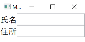
テキストボックスの左側に説明がついているのが確認できる。続けて説明部分の幅を固定幅にするため、TitleWidthを設定してみる。
<local:LabeledTextBox Title="氏名" TitleWidth="100" />
<local:LabeledTextBox Title="住所" TitleWidth="100" />
実行してみる。
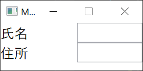
説明とテキストボックスの間隔が広がったのが確認できる。
結論
DependencyPropertyを用意してXAMLでバインディング出来るように定義すれば、良いカスタムコントロールが出来そう。 このくらいのカスタムコントロールであればGridで並べた方が楽だけど、プロジェクトで統一する必要があるなど、同じ使い方を要求される場合には用意してもいいかもしれない。